使用 background-size 让精灵图实现自适应缩放
background-size 除了可以设置 cover、contain 这两个值,还可以自定义设置大小,比如:backgound-size: 10px 20px 或者 background-size: 10% 20%,前者以像素为单位表示背景图的大小宽10px 高20px,后者以百分比为单位基于父元素大小计算,效果与 img 标签的 width、height 是一样的。
如果要实现背景图自适应缩放,可以使用百分比/em/rem/vw/vh等这些单位实现。
实现代码
<div class="girl t1"></div>
<div class="girl t2"></div>


<style>
    .t1{
        width: 220px;
        height: 300px;
    }
    .t2{
        width: 120px;
        height: 200px;
    }
    .girl{
        float: left;
        -webkit-animation: run .7s steps(7) infinite;
        background-image: url(https://static.webfed.cn/o_1acen802t1ues153fpjf11k76kue.png);
        background-size: 700% 100%;
    }
    @-webkit-keyframes run {
        0% {
            background-position: 0 0;
        }
        100% {
            background-position: 700% 0;
        }
    }
</style>
效果

精灵图:
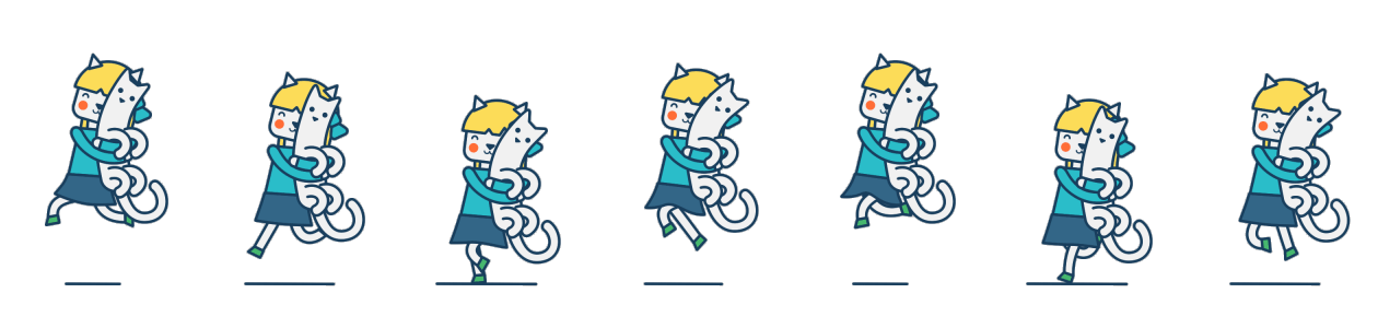
核心代码:
.girl{
   /* 要显示的具体大小,宽高比例必须是正确的 */
   width: 220px;
   height: 300px;
   background-image: url(https://static.webfed.cn/o_1acen802t1ues153fpjf11k76kue.png);
   /* 精灵图里女孩有7个,因为页面只会显示一个,所以宽为 700% */
   background-size: 700% 100%;
   /* 取精灵图里第几个,700%表示取第7个 */
   background-position: 700% 0;
 }
在做移动端适配的时候还可以换成 rem 为单位实现自适应。